Can We Help Ultimate Ebook Creator?
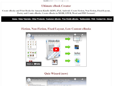
This is the Ultimate Ebook Creator- no affiliate link :) It has been designed by Nitin Mistry. It averages around $25 for sales if you want to promote it.
The website has some cool things going for it:
- its clean
- Youtube videos are right there and then
- the price isnt too high for a piece of software with lifetime support and templates
- tons of testimonials
- nice Youtube testimonial
- nice video tutorials- gives more familiarity to the program- that you are quite open for people to see the process
- really like the idea of showing customer ebooks, this is a really nice touch
What can be done about Ultimate Ebook Creator?
Does there need to be anything done?
Well, yes. if this software is so good and actually produces the results then why isnt it ranked higher in Clickbank?
Well to understand this we have to go to the very start of Clickbank
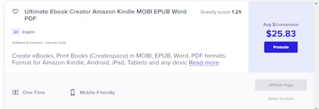
This is the affiliate sign up box on Clickbank. Looks nice, but there are tons of information that honestly the affiliate does not care about initially. Title is OK but then it is repeated in awesome real estate that is the info box. That box should be mentioning- straight away (not hidden):
- 3000 books already published on Amazon
- create Professional ebooks
- lifetime updates
- video testimonials
So something on the lines of: "3000 ebooks already on Amazon. Happy authors giving great testimonials of the pro ebook making software with lifetime updates and awesome customer service". For the first paragraph then add the formats supported after.
Also, where is the affiliate signup link? Can't click on it on Clickbank. There is no link on the main site either. So you may have willing affiliates wanting to sign up...but...no sign up button. (Update). After many moons of searching, I found the affiliate link is discussed in a video and a bullet point of where to find the product- no hyperlink? Preferable to link directly to your Clickbank page with a link at the bottom of your main sales pafe that states "affiliates".
The main site.
This is where it gets interesting. Because most of the positive points that we have covered are in, some way shape or form, hindering the flow of the website. If there is no flow then there are no sales.
So:
- The videos. Are cool at the top of the main page but you have copied other sellers. They create Youtube videos but they host them in a separate window so that they can control what happens when the video ends. Unsure why the Quiz Wizard is there. I would try and get some sort of heatmap here and figure out what people are clicking on. I suspect they might not be clicking the buy now button straight away.
- Promote what it really does. You are up against Word and other free publishers and the free process that Amazon does for you. So you have to figure out why the Ultimate Ebook Creator is different. It seems like it can publish to to other providers by a click on a button (this would need to be clarified). Of this is the case then automation is your USP (ultimate selling proposition :) )
- Theres a lot of text and subheadings.
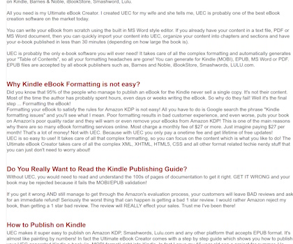
This is on the main page. Now it might look clean but red colouring seems to underline urgent. Too much text and people can't read it. Break it up, bold some of the cool text. Bullet point other text. Sure the bullet points come later, but there is waaay to much going on.
- Links. Within the ext should not propel you out of the text and onto someone elses website. Open in new window- if you really have to. Better still, don't link to outside companies.
- You. You need to be at the start if possible saying who you are. At the bottom of the screen is OK but, at the top is better.
- Check your text. This shouldn't be on the main sales page:

- Sales page format. Your sales page should go something like this. Hi who am I. What are the problems you could be facing. How I accomplished the solution. What is the solution/ how do I buy it. What does the solution come with. Your sales page has too many thoughts and ideas that it can be confusing. Your sales button should be at the bottom with PS. PPS. PPPS. The PS is where you list what it works on, your guarantee/ customer service. before your payment button you should have a box with relevant bullet points of what the product includes. Then Bonus 1, Bonus 2. Testimonials can be littered throughout the sales page or before the product sales button. But, they shouldnt be linked to a separate page. You can have a separate testimonial page but not linked from the sales text.
- Amazon Books. These are gold mines to you. A lot of the books have 4+ star rating and have been downloaded tons of time. I would rather have pictures of those as well as testimonials on the sales page.
- Links part 2. Got to say it again because there are so many. Get the links that link to other sites off your main sales page. If you want to talk about someone who has a book generating $300-500/ month then have them detailed in a separate box on your sales page.
- The video tutorials. I don't mind this but I would rather have them as private and have them as a bonus rather than on your main website. If you want to promote through Youtube then get testimonials of people building ebooks with your software. Oooor, create ebooks yourself with your software and have that as marketing materials
- Free? Your bonus ebooks are also your free ebooks which might not be a good selling point
- Titles. This is the picture of the main website title bar:

This is the title bar when you click on some of the links:

Different and I had to check that I was on the same site. I prefer the second bar anyway :)
- Other products. Get rid of the top link to your other products. It is confusing and transports people away from your main goal of selling the Ultimate Ebook Creator. There are also affiliate links in some of those links which you don't want. Use those products as upsells or to discuss with your subscribers.
- FAQ. Your FAQ needs to be tidied up. The sales page FAQ is related to the product that is going to be sold. How much, what device can it be used on, is it offline, how many computers can I install the software on. All those are completely valid. What isn't valid are actual product related questions which once you bought the product makes much more sense. Take the below question. Why not link to a video, or just state rather than possibly searching through videos. Also this question is not needed on the sales page FAQ.

- Bye text. There is no popup for when a person leaves the page. Clickbank offers these and usually you offer a little incentive, bonus, something for free or a discount to get people back or to think about a purchase
- Discount. This also comes onto the affiliate page. You need an affiliate page to help people sell your product. Discount codes are helpful here, buying stats, keywords, the ebook software market. All these are hlpeful tools to help an affiliate sell your product. is there are time trial or a reduced function version of the software which people can download for free but has the 60day cookie within the link to get the full version?
As per always we wish Nitin all the best with their endevours.
About. Updates. Disclaimer. Privacy. Mission/ Vision. FAQ. Newsletter.
Copyright © 2024- Jasonera.com All rights reserved
