2. Building And Selling Digital Products
Gizmodo
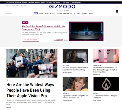
You are doing Gizmodo? Didn't we learn from our Engadget overview?
Well. Sometimes We find that large websites are different to smaller websites. Apart from their size they seem to go against the grain of what is SEO and the wants customer needs. There are:
- links to a variety of onsite pages/ articles on the main page
- none of the description texts are long
- it seems to be made up of tons of widgets
- it has SEO and customer love
- Gizmodo seems to be generating around $300k/month from Ads
- theres quite a few ads per article
- Email sign ups are everywhere
- The
set up is very much like Engadget- like they use a similar template
(even at the top navigation bar has "video" attached to it
So it seems that as long as you are generating cash and that your audience loves you, who cares about SEO and Google right?
Can Gizmodo do more and improve their sales process?
Now coincidentally, because Gizmodo seems to share the same template that Engadget does, it suffers similar issues. But. I find that Gizmodo actually has a better flow in some places. In others, it is odd:
- This is the homepage:

Those articles, are they updates or anything else? Because just below this is what we have
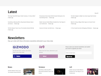
The "latest" information is tiny in comparison. But what is
the difference? Is it latest in all their topics/ news? If that is the
case what are the articles at the top? Then the top navigation bar
suggests home, news and latest...is there a difference?
- Articles 2. I clicked on a Television article and it was nice. Then I passed a bunch of adverts then on the same page the topic became "spaceflight". So the articles of similar topic don't go into one another
- The ads between the articles also feature links to Gizmodo articles. This is clearly by design. Do you find people click on the articles or do they click on the ads? Do they mistake on for another? Do they come back to your site if they clicked on an Ad?
- I saw an ad for a Podcast you created. Do you have them, are they top tabbed linked or are they part of an article and when I find the article I find the Podcast? Ooh. I found the Podcasts, they are in Quartz which is a subsidiary of Gizmodo. Which was unnerving to see as the sites are very similar in appearance.
- Backgrounds.
Just something small and subtle but looks nice. The background for
latest, and home are blank. The backgrounds for science, earther, io9
etc all are different colours but similar style. Looks nice and houses
them under one family
- Newsletter. It has pride and place on most of the webpages which is cool. This one comes from the homepage:

You can add general or the io9. The io9 states that it is news from the future. However, that is not what the title of io9 is, it is movies, tv, comic news. Again, I am unsure why these email lists are not segmented to news, discounts, tv/movies, AI.
- Video.
Your videos are short, but is there a way to make some of your
articles/ videos smaller- like an overview. Could they be TikTokable?
Now, you may have have a TikTok account, but could that be placed on
your site. It might introduce people to more of the articles?
- Video 2. I like it that your videos are in-house, you are not transported away to another website to view them. However would excerpts/ reviews or weekly updates be an idea for your Youtube channel? I don't see your social sites advertised well, but funnelling Youtube to your video might be nice. I am unsure why you have "search videos" at the bottom of the screen:
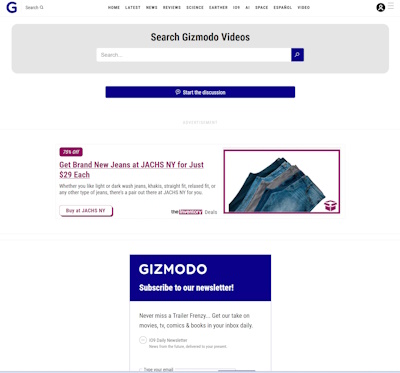
As you can see, after the advert there is a newsletter signup for the main Gizmodo email, but on this there seems to be text suggesting that people will get movies/ comics/ tv info. But, the original Gizmodo signup box didnt suggest this. So is the the main email or is this a segmented email?
- Love the idea of a store. Like it that each category is represented in the store. However this is what you get when you click "all":
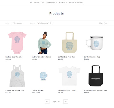
Products just seems so generic. But, when you click on store on any of the pages you get this:
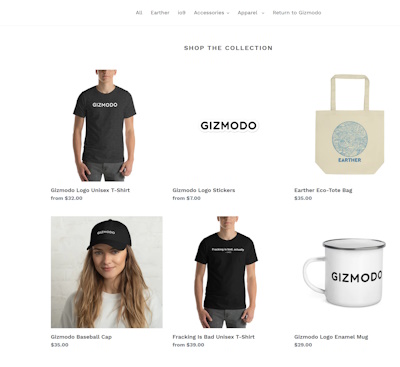
This seems to be a much better "front page". Also, why can't you go onto the categories store when you click on their store link? At the time of writing io9 has only a t-shirt on offer, which for a movie category seems woefully lacking. As a side. Offering bonuses and discounts increases purchases.
As per always, we wish Gizmodo all the best
More case studies can be found here.
Jasonera updates? Can be found here.
About. Updates. Disclaimer. Privacy. Mission/ Vision. FAQ. Newsletter.
Copyright © 2024- Jasonera.com All rights reserved


