2. Building And Selling Digital Products
Smashingmagazine, Content And Earning.
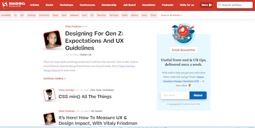
You may or may not have heard of Smashingmagazine. They are a website/ company that creates content for online design.
The website truly lives up to its powers of design. We have no design skills but you know that effort has been taken in their website. Check out at the bottom of their home page.
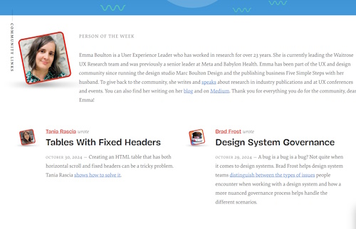
Those are articles so nicely spaced out. The person pictured? Not an editor but a community member that is highlighted for the week- with links. You hover over the picture, it moves. It's a cool touch.
This theme runs through the whole site. Clean, fun, but serious. It is a difficult balance but one that is done really well on the website. There's also a fox/cat mascot which also increases trust and a brand appearance.

SmashingMagazine is nice
First off, the community seems to be a focus to the team. There is a membership area. A lovely newsletter signup page which has to be reprinted here:
"Our newsletters are curated, written and edited with love and care. No third-party mailings or hidden advertising. Ah, and you’ll receive Vitaly's Interface Design Checklists PDF as a little gift as well.
We keep the number of ads per issue to a minimum. To help us cover our costs, we send out at most one monthly special issue which is dedicated to Smashing projects and products. Such emails are sent out at most once a month. Your data is always safe, and your support really helps us pay the bills."
This is what you get, this is what you can expect. It is so nice.
And the stats prove it (from SimilarWeb):
- 98k website in the world
- 700k/ month traffic
- 194 top referral sites sending most of the traffic- 40% mainly related to the sites content
- 7k Youtube subscribers with 193 videos
- 890k followers on X- with big named brands following them
- 5.3m monthly views on Insta
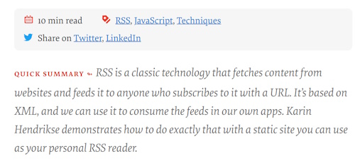
The articles can be shared through Twitter/ X which is a quick spread route. Or it can be spread through LinkedIn which is a more professional social network. And again, fits in really well with the content. Also giving a quick summary to the article and minute read- sure bounce rates might increase but then you have more chance of finding people who are interested in the article:
How is Smashingmagazine making their money?
Before we start they could make more. On their website I could not find their social links. Is this the reason why they are reduced in Youtube which you would have thought a big channel to have?
Same with some of the articles, they don't seem to reference the social aspect.
The content is big and juicy but it would be nice to follow with a video or a quick slideshow presentation rather than just text. However they do have links to related downloads and templates on the pages which help.
They make most of their revenue from the following:
- On site Ads
- Their own ebooks and books- with books ranging from $50-30. Odd that some could be compilations- including templates, videos, worksheets etc. However you get a discount if you signup to their membership
- Membership fees- depending upon the level, you get access to all ebooks, discount print books, discount seminars and workshops, reduced price for training
- Workshops (which opens up in the same window, not a separate one)- one was $450 but was 5x2.5 hour workshops with live exercises, lifetime access to recordings and more:
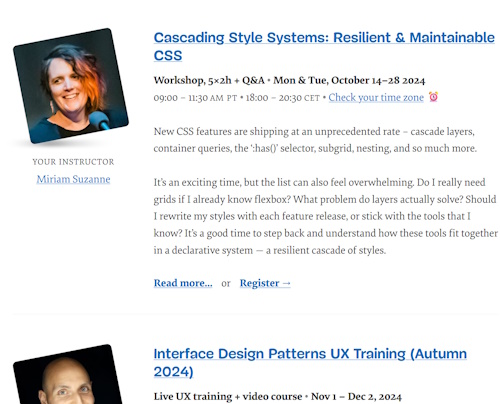
There was 12 workshops this year (2024).
You can also purchase bundles at different rates.
- Conferences. These are big money makers because sponsors also help offset the cost. With membership there is a discount. They go worldwide and they are online as well. It's 2 days, 13 speakers. The in-person tickets have been sold out for this year. But there is a link to join online
- Job board. You can post a job for freelance or full time and each has a separate listing fee.
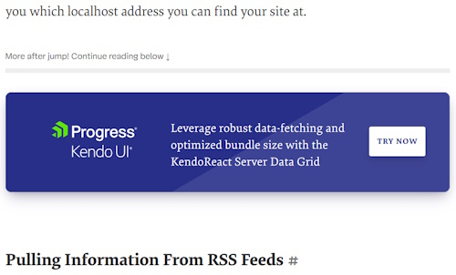
But if you notice, they are all related and each don't seem out of place. Why not have a conference? yes, it is a good idea to have workshops. Books/ eProducts seem to gel really well. Ads? Sure, they are not intrusive and nicely integrated in to the text:
How much?
First, the content niche that they chose is a good one:
- visual and can be used on different platforms
- able to show what you can do without "promoting"- just by the look of your website
- designs, usability and online design are always being updated so there is no lull in content
Smashingmagazine started in 2006 so it is not that old in regard to some websites. But they have strived to gain fans and community. Why? Because the niche is competitive and the barrier to entry is kinda low especially if you are an online designer. So it is:
- build an audience
- amaze them with content and ease of use
- bring them into your brand with shout outs, conferences and memberships
I have read online that they make around $200k which might have increased over time as that figure, coupled with what they are doing seems low.
Check out other online case studies here. Updates? Check out the Jasonera blog here.
About. Updates. Disclaimer. Privacy. Mission/ Vision. FAQ. Newsletter.
Copyright © 2024- Jasonera.com All rights reserved


